After week 3 presentation where our plan was very simple we made sure that we got down a much better plan that shows towards alpha and after alpha so we know where we are with work and keep things on track.
Asset work
After getting down the texture style we wanted I went in and started modelling and texturing some more assets for the level.
The post box which is going to be in the street area of the level was the next asset I worked on.
This is what the first texture looked like when I finished texturing it.
After texturing it and applying the texture to the model I realized that it needs something else because the colour is way too bright and there is no detail to the post box except the sign and the hole to post letters. So I decided to add more to the texture and give it a lot more detail and make it look much more like a post box.
This is the final texture I did, as you can see compared to the other texture it has a lot more detail and looks more like a realistic post box.
Once I finished on the post box I then moved straight on to something else. I worked on pool table balls because I thought they would be quite awkward to make and make sure the texture for each ball fits perfectly on the ball.
As you can see the pool table balls turned out quite well in the end and I finally managed to finish texturing them.
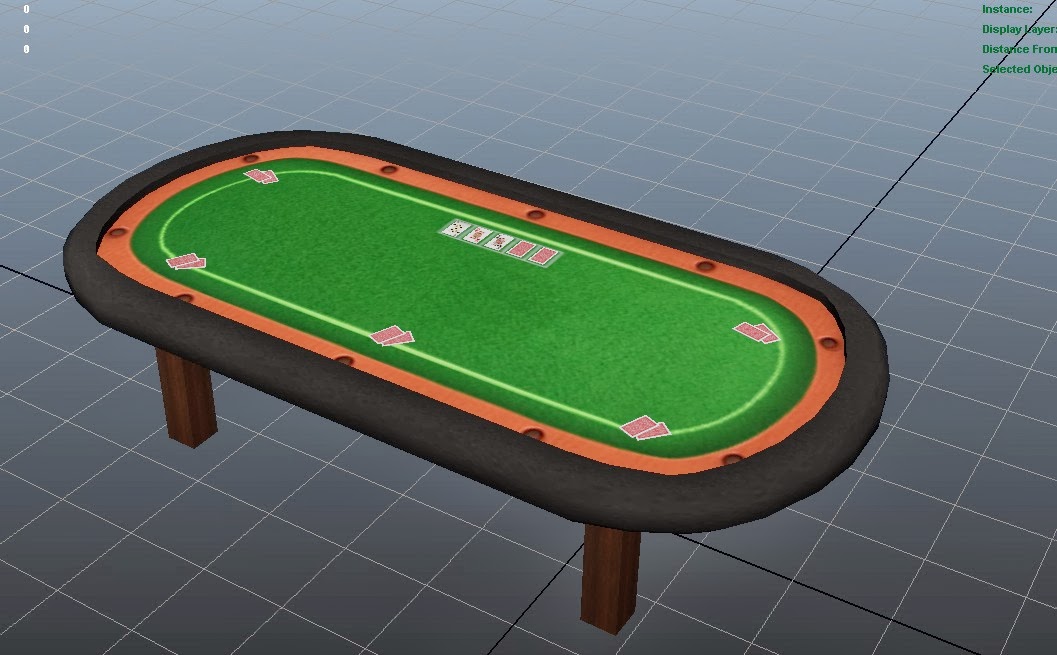
Next asset I worked on is the poker table for inside the bar.
After finishing modelling and texturing my poker table this is what it looked like with basic texture.

As you can see not much detail to the asset so I then went in and started to add in the details to make it look much better and more realistic.
This is what I got after I finished adding in the details to the poker table. As you can see it looks much better and detailed compared to previous image.
I decided to work on the fire hydrant asset next and worked from the block out model to add to it and then get it textured.
This is what it looks like with basic texture.
As you can see not much detail so I think I need to add some dirt and grunge to it to make it look more realistic.
This is what it looks like with better texture and dirt and grunge added to it.
As you can see it has bit more detail to make it look more realistic with the dirt and grunge.


No comments:
Post a Comment