The first week of Advanced 3D Graphics was a lecture about the module and what it is we have to do for our assignment work.The lecture involved a recap of some of the next gen concepts and some of the different types of texture maps which I may or may not have used before on previous work.
Normal map
Normal maps are quite common in the games industry especially when it comes to next gen games. Basically a normal map is generally used to create fake high-res geometry detail when applying it the a low poly mesh, this gives the low poly mesh the same detail that a high poly mesh has and still gives of the same effect.
Specular map
A specular map is a map used to highlight colour and to define a surfaces shininess. For example floor tiles when light is shining on them etc. Very good for that extra bit of detail to the environment or asset.
Global Illumination
This is used to add much more realistic lighting to a 3D scene. It takes the light from the light source and makes it reflect of other objects around the scene giving of more realistic lighting. Reflections, refractions and shadows are all examples of where Global Illumination is shown.
Subsurface Scattering
This is a mechanism of light transport where the light penetrates the surface of a translucent object making the light come through the mesh. This gives of a much more realistic feel, especially with human skin etc.
Concept idea 1
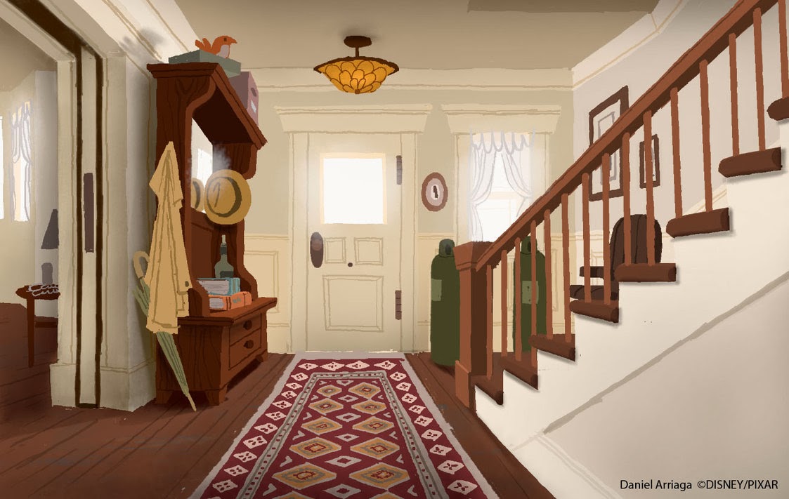
Before I started the module I was planning on working on my own, on a piece of concept from a movie called UP.
I found a piece of concept for the house in the movie and I was going to be working on the inside area of the house. I was then going to put this into my portfolio providing it was good enough to be in it.
As you can see these were the areas I was going to focus on using realistic textures changing the style of the movie.
Concept idea 2
I changed my concept idea because me and a friend decided to work together on a new piece of concept art. We wanted to build a pub/bar using realistic textures but we were told it was not enough for two people.
After we got the feedback about the pub/bar we decided to look for some more concept art which we could use to get an idea of an outside area we could work on and that would be enough for two of us to do.
This is the area I found which I think would be a good area to work on and seems like a good location for a pub/bar to be situated. Also I feel like this gives us enough work for the two of us to be working on.With this overall idea we have decided to still work on the inside of the pub/bar and then the outside area shown above blocking of some of the road which will hopefully work really well with the concept. Both me and my team mate agree that this concept fits well with our pub/bar idea which is why we decided on this.


No comments:
Post a Comment